The Quilt Chart, also known as Callan’s Periodic Table of Investment Returns, visually represents the performance of different asset classes over time. It gets its name from its resemblance to a patchwork quilt, with colored squares representing various investment categories (such as large-cap stocks, small-cap stocks, bonds, and international equities). Each year, the best-performing asset class appears at the top of the chart and the worst at the bottom, creating a seemingly random but informative pattern—much like, well, a patchwork quilt.
What the Quilt Chart Can Teach Us About TSP Returns
Using the Quilt Chart with the TSP Funds can help us see the randomness of market leadership in the TSP funds and understand why diversification is key. Unlike a standard investment performance graph that only highlights the long-term winners, the Quilt Chart shows how volatile the journey can be.
💡 Knowledge Check: The TSP core funds consist of five options. The G Fund invests in U.S. government securities specially issued for TSP. The F Fund tracks the Bloomberg U.S. Aggregate Bond Index. The C Fund mirrors the S&P 500, while the S Fund covers small- and mid-cap stocks not included in the S&P 500. Lastly, the I Fund invests in developed international markets, including Europe, Australasia, and the Far East.
This chart clearly illustrates that every TSP fund experiences ups and downs, emphasizing the importance of diversification. Thus, helping us see why spreading our investments across multiple funds is a smarter strategy than simply putting all our money into one or two funds and hoping for the best.
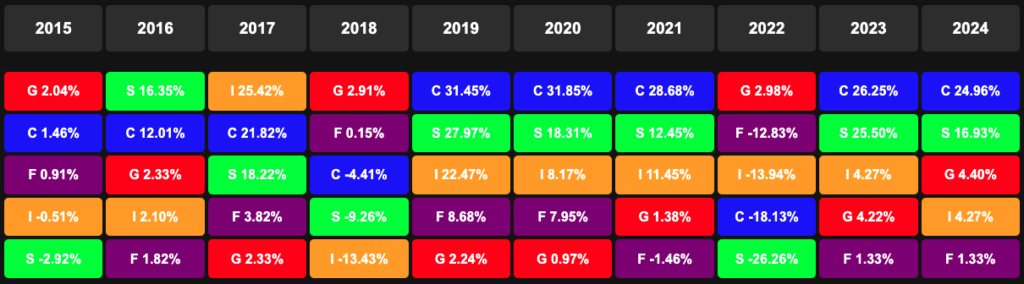
The C Fund’s Decade of Dominance vs. Its Lost Years
At first glance, the quilt chart above makes it tempting to focus solely on the C Fund. We can quickly see that it ranked first in five of the last ten years! The worst year for the C Fund was in 2018, with a market drop of 18.13% only for that loss to be quickly erased in less than 12 months. Amazing, right?! However, when looking at quilt charts across different periods, a deeper story emerges about today’s top-performing funds.
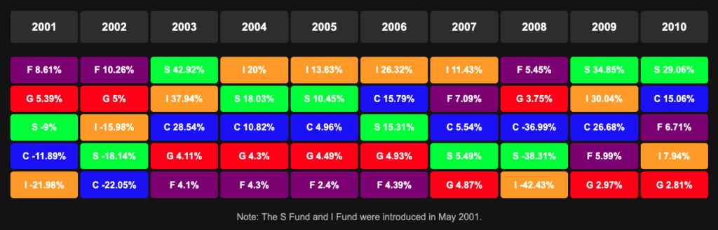
It may be hard to believe this, but from 2001 to 2010, the C Fund never once finished in first place for annual performance. That’s right…not once! The early 2000s saw the bursting of the dot-com bubble, and 2008 brought the Great Financial Crisis. Many federal employees lost confidence in the C Fund, shifting toward the G and F Funds in search of safety. Many of those old timers never came back to stocks and are still in the G Fund today. I think that’s because they understandably became risk adverse after being punched in the face so hard, moving everything into the G Fund, then, missing the C Fund recovery when the market rebounded strongly in the years following 2009. Some of those folks who fled to the G Fund never reinvested in stocks, missing out on significant gains. See the 2001-2010 cart below that illustrates this.
Fast forward to the present, a significant portion of today’s federal workforce were not around to experience these turbulent years firsthand. Many newer employees have only witnessed the C Fund’s dominance from 2011 onward, never having lived through an extended period where it underperformed…for a decade! Understanding this history is crucial—markets go through cycles, and assuming the C Fund will always be the top performer can be a dangerous mindset.
What Can We Learn From This?
For federal employees navigating the Thrift Savings Plan (TSP), the quilt chart is more than just a colorful chart, it’s an essential tool for understanding the dangers of chasing performance and the power of diversification.
The Illusion of Patterns: Just like real patchwork quilts are carefully stitched together, yet appear randomly arranged, the TSP Quilt Chart can create the illusion of a pattern—until it doesn’t. Past performance may feel reassuring, but it offers no guarantee of future success. This unpredictability serves as a reminder that, no matter how much we search for order, markets often move at random—making it just as likely that luck, rather than skill, determines the outcome.
Investors often focus on returns charts, focusing on the long-term line or lines that end up above the rest (like the C and S Funds), but the challenge is in enduring the volatility along the way. Staying the course with a diversified portfolio is far easier in hindsight (especially staring at a graph) than in the moment, and the Quilt Chart helps illustrate that success is never a straight line upward.
A Reminder of Market Cycles: Burton G. Malkiel famously said, “A blindfolded monkey throwing darts at a newspaper’s financial pages could select a portfolio that would do just as well as one carefully selected by experts.” This highlights the unpredictable nature of markets and the risks of emotional investing. Those who fled to the G Fund for safety and never returned to stocks missed out on the market’s powerful recovery.
“A blindfolded monkey throwing darts at a newspaper’s financial pages could select a portfolio that would do just as well as one carefully selected by experts.”
— Burton G. Malkiel, A Random Walk Down Wall Street
Diversification as a Quilt, Not Just a Safety Net: A quilt’s strength lies in its many pieces coming together. Likewise, a well-balanced TSP portfolio isn’t about picking a single fund but stitching together a mix that withstands time. By holding a mix of C, S, I, F, and G Funds, federal employees can smooth out volatility and benefit from the different strengths each fund provides over time.
Final Take-Away For TSP Participants
For the average TSP investor, the Quilt Chart serves as a visual roadmap to market cycles. It highlights an important truth, that leadership in the market is never constant. Funds rotate, economic shifts happen, and external shocks like recessions, pandemics, and financial crises, can impact performance in unexpected ways. The key takeaway? A diversified portfolio is the best hedge against uncertainty.
A well-balanced allocation across TSP funds is the best hedge against uncertainty. Life Cycle (L) Funds offer a hands-off, professionally managed approach, automatically adjusting over time to maintain diversification. For those who prefer a more active role, a mix of stock funds (C, S, and I) can provide growth potential, while keeping a portion in the G Fund can add stability, helping investors stay the course during market volatility and sleep well at night.
But just as important, resist the urge to chase winners or jump between funds when times are scary or uncertain. Chasing past performance or reacting emotionally to market swings often leads to buying high and selling low, which undermines long-term success. Sticking to a disciplined strategy and re-balancing periodically is the best way to navigate the ups and downs of the market.
Let’s face it, investing is emotional. When markets drop, fear takes over. When markets rise, greed sets in. But the Quilt Chart reminds us of the bigger picture—every patch, every color, every year is part of a broader pattern. No single investment will outperform the rest indefinitely. The key to success isn’t trying to time the market , it’s time in the market.
Don’t chase past performance. Build a well-balanced TSP portfolio that can endure market cycles. A single piece of fabric is fragile, but a quilt that’s stitched together with care—can last for generations. Your TSP should too.